Urban Hotels
Hotel collection in the center of Florence

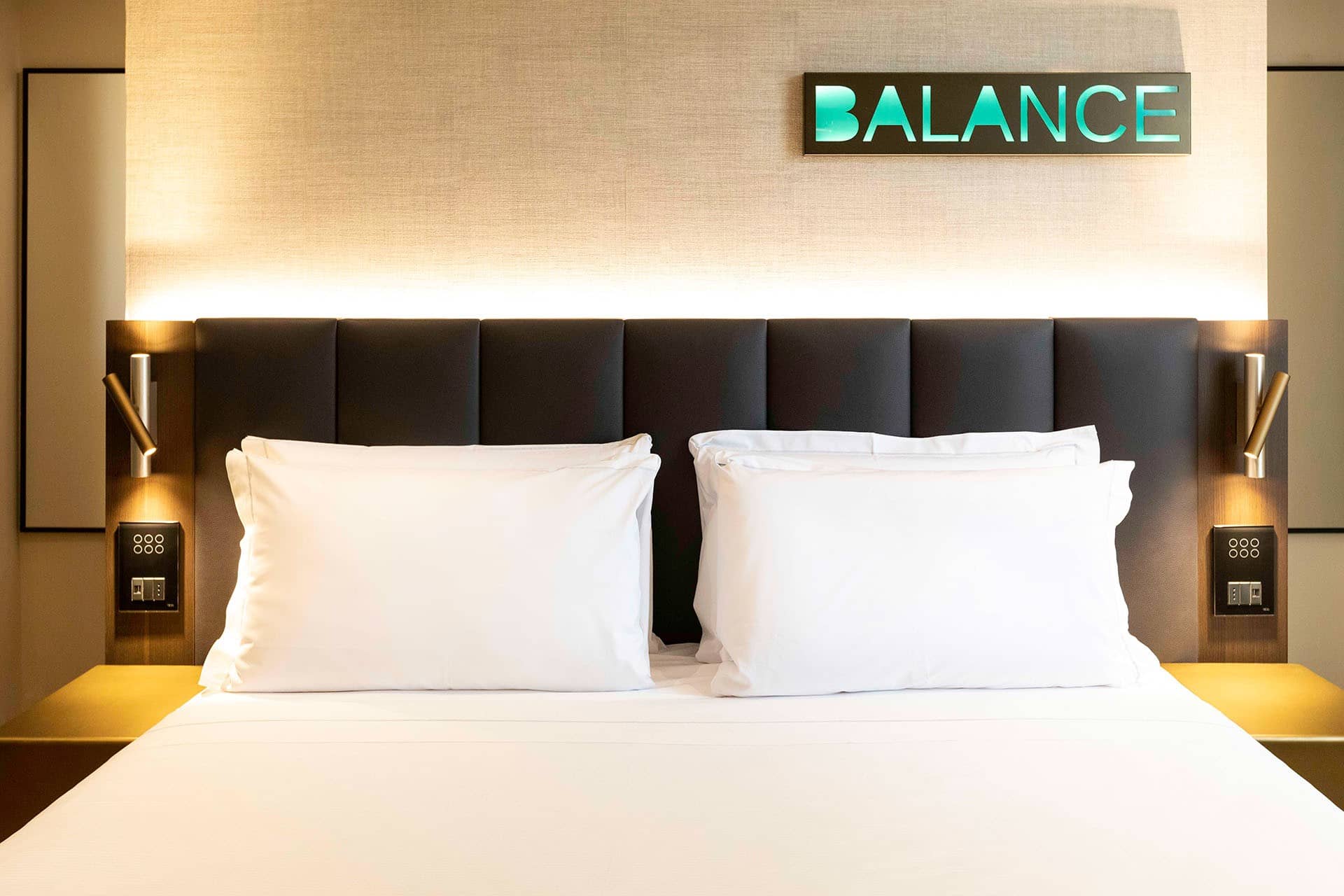
The properties of the Urban Hotels group are located in the historic center of Florence and offer comfortable stays with a strong focus on sustainability. We began the project by defining a brand image that fully represents the group's values. Similarly, we identified the appropriate tone of voice to speak about Urban Hotels, which translates into warm, welcoming, and emotional copy without being overly emphatic.
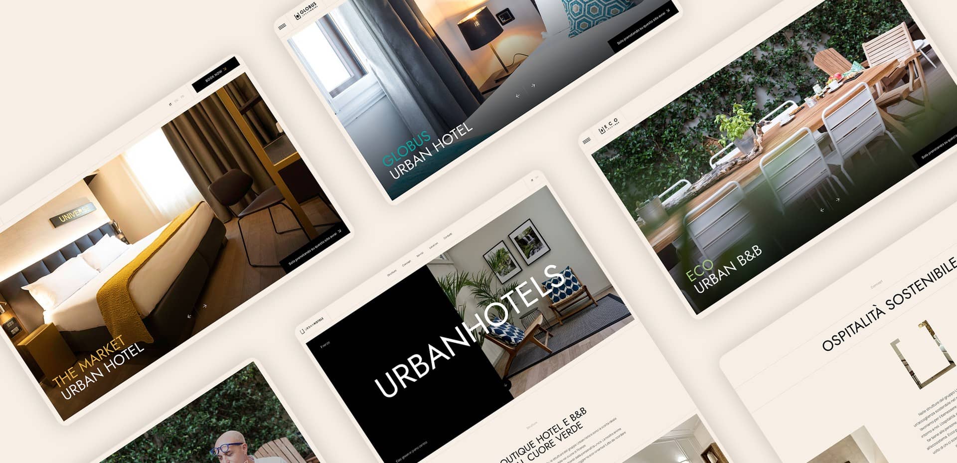
As a first step, we created websites for each individual hotel, designing a unique and original layout. The graphic concept was conceived to best represent the modern and design character of all the group's properties, through the use of sans-serif fonts and a geometric layout. The color palette is tailored to each represented property: black and various shades of beige are associated with a primary identifying color for each hotel, which is then used in certain design elements. The result is an elegant layout that imparts exclusivity and immediate communicative appeal to the websites.
Full-screen blocks and large photos add dynamism, making the design modern and friendly while maintaining its refined nature. The use of icons to represent the green essence of Urban Hotels adds further movement to the graphics, sparking user interest and a connection to the brand's values. These same stylistic choices are confirmed on the corporate website to ensure immediate brand recognition and increase brand awareness.
The copy of the new websites adopts an engaging, friendly, and warm tone of voice, conveying the authentic hospitality of the group and the friendly spirit of the staff. The vocabulary is enriched with easily understandable Anglicisms for the Italian target audience, to represent the cosmopolitan nature of the three Florentine properties.
What we did

Are you interested in a similar project?
